Let’s Talk Branding
February 3, 2022
Sean Geary, Clown Shoes Beer Brand & Sales Director
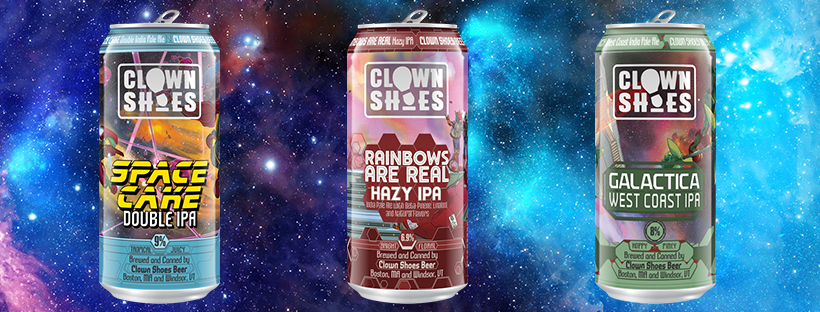
Let’s talk branding. How many times have you thought about a brand and had a company’s logo in your head before anything else? It happens a lot. Not as much as we thought with Clown Shoes though. From some consumer research we gathered that people see our artwork first, not necessarily the brand. With a Space Cake can, for example, the eyes first land on Mike’s shoulder, then an obscure point on a laser beam. It becomes hard to find the brand name, let alone the beer name and style. We fell a bit short there. It’s not for a lack of effort—we’ve tried hard to bring something to life to define the brand over the past 12 years, but our best work has been creative liquid and art, not branding and logos. By now you may have seen our newest logo, but before we get to that let’s take a step back…
Logo Attempt 1: The beginning
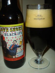 Okay, so looking back on this I’m thinking thank God the beer was delicious and thank God it was 2009 and not today. Quite the throwback here. Did we notice that the beer in his glass doesn’t even match the color of a Black IPA?! The logo itself doesn’t exist. Remember, Clown Shoes started as a project to bring an amazing beer to the market (which was successful), but building a brand was not front of mind. Is that gum on his shoe?
Logo Attempt 2: OK, we’ve got a brand on our hands
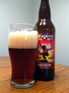 Alright, so we’ve got a brand now and we’re distributing in a few states. Let’s get moving on a logo! Our artist at the time was able to draw this one up based on ideas put her way. We wanted to make sure the shoes were there, have a bit of fun with a unique font, but stay away from any kind of clown/circus theme.
Logo(s) Attempt 3: The tale of two logos
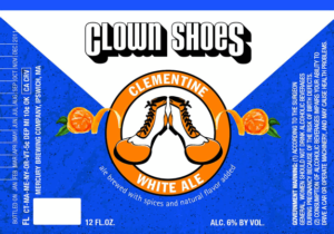 As we evolved, we changed things up a bit. We moved from 22oz bombers into 12oz glass bottles and made some labels that don’t reflect the art we’re known for today. This didn’t last too long. Also, we didn’t stray too far from the art—the 4pk holder was more art-forward.
Logo Attempt 4: Embrace the circle
![]() OK now we’re getting somewhere. Identifiable, descriptive, bold, exciting, fun… but a bit tough to position on cans, as we found out in 2018 when we used this as our primary logo. It could never center properly so most of the time our cans were unidentifiable, outside of the artwork on the cans. It also didn’t work right for bottles, so we had to make a primary logo (attempt 5) and leave this as a secondary. The circle has worked well for tap handles, stickers, patches, and a lot of other round things though!
OK now we’re getting somewhere. Identifiable, descriptive, bold, exciting, fun… but a bit tough to position on cans, as we found out in 2018 when we used this as our primary logo. It could never center properly so most of the time our cans were unidentifiable, outside of the artwork on the cans. It also didn’t work right for bottles, so we had to make a primary logo (attempt 5) and leave this as a secondary. The circle has worked well for tap handles, stickers, patches, and a lot of other round things though!
Logo Attempt 5: The main event
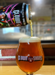 A combination of elements from previous logos, this one has suited us well for many years. We’ve identified with it, have been proud to put it on cans and merchandise, and it can be used across any product format we make. Doesn’t this look amazing? The Space Cake does, but as time has gone on the logo seems to get lost. Does this image make you want to grab a beer for the unveiling? Sure makes me want a Space Cake…hang tight… *crack*
Logo Attempt 6: The future
![]() Alright so here we go! Our new stamp of approval. The furthest we’ve strayed from our original “concept”. A modern update that can be seen from a distance but won’t get in the way of our artwork. A symbol that says who we are, but also keeps it vague enough to wonder what we’re about. No references to, or portrayal of, circuses or clowns. This is fun, unique, and will fit well with every package we design, and any merchandise we (eventually) will have available. We wouldn’t be where we are today without evolving, and we’re looking forward to seeing what comes next.
Alright so here we go! Our new stamp of approval. The furthest we’ve strayed from our original “concept”. A modern update that can be seen from a distance but won’t get in the way of our artwork. A symbol that says who we are, but also keeps it vague enough to wonder what we’re about. No references to, or portrayal of, circuses or clowns. This is fun, unique, and will fit well with every package we design, and any merchandise we (eventually) will have available. We wouldn’t be where we are today without evolving, and we’re looking forward to seeing what comes next.